Small text and intricate artwork can look excellent on a large computer monitor and still become difficult to read when the design is reduced to its intended transfer size. That is why fine-detail review should happen before the artwork is placed into a DTF gang sheet, not after the sheet has already been organized around the design.
The central question is not whether you can zoom in and see every detail. The more useful question is whether the information that matters remains clear at the size in which the transfer will actually be used.
This guide focuses on that readability decision. It is not a general file-preparation checklist and it does not assume one universal minimum font or line thickness for every design. Instead, it gives you a practical way to decide which details should stay, which need adjustment, and which should not be trusted at a smaller finished size.
Stop Judging Small Details at 400% Zoom
Zoom is useful for finding rough edges, accidental pixels, and other file problems. It is not a reliable way to judge real-world readability.
A design that fills half your monitor may eventually become a small chest transfer. At high zoom, every letter can appear spacious and every line can look substantial. When the artwork is returned to its intended physical dimensions, those same elements may compete for very little visual space.
Use zoom to inspect the file, but use intended print size to make the final design decision.
Identify Which Details Carry Meaning
Not every small element has the same importance.
Start by separating essential information from decorative detail. A tiny texture inside an illustration may be optional. A business name, event date, phone number, product wording, or required identifier may be essential to the purpose of the design.
Ask:
- Which text must be readable?
- Which visual detail defines the artwork?
- Which elements are purely decorative?
- What could be simplified without changing the message?
This hierarchy matters because the solution to an overcrowded small design is not always to enlarge everything. Sometimes the better choice is to remove low-priority detail so the important information has more room to work.
Review Text as a Reading Task, Not Just a Graphic Element
Small text should be evaluated by whether a person can actually read it under the conditions in which the garment will be seen.
Look at the final-size artwork without relying on extreme magnification. Pay attention to letter spacing, narrow counters inside letters, very condensed typefaces, thin strokes, and multiple lines of copy packed into a small area.
A phrase can be technically present in the file while still being functionally unreadable.
If the text is important, consider practical changes such as:
- reducing the number of words,
- using a simpler typeface,
- increasing the physical size of the text,
- increasing spacing where the design allows it,
- removing unnecessary decorative effects,
- giving important wording more contrast or visual separation.
The objective is clarity, not simply preserving every original design choice.
Thin Lines and Tiny Detached Elements Need Their Own Review
Fine-line illustrations often contain small strokes, isolated dots, narrow outlines, tiny stars, distress textures, or other details that appear visually connected on screen but exist as very small independent elements in the artwork.
Review those pieces at intended size and ask whether they are important enough to preserve.
If a tiny element disappears visually when the design is viewed at normal scale, enlarging the source file does not automatically solve the design problem. You may need to strengthen the element, simplify the illustration, combine nearby shapes, or remove detail that does not contribute meaningfully to the finished graphic.
This is a design-readability decision rather than a competition to keep the maximum number of pixels.
Watch for Detail That Depends on Very Tight Negative Space
Some designs do not use thin lines, but they still depend on very narrow empty spaces between larger shapes. Small lettering reversed out of a solid shape is one example. Closely packed geometric artwork is another.
At a large design size, the empty spaces clearly separate the elements. At a much smaller size, those gaps can become visually crowded.
Review positive shapes and negative spaces together. If the design depends on tiny gaps to remain understandable, consider whether the artwork needs more breathing room at the intended transfer size.
Separate a Source-Quality Problem From a Design Problem
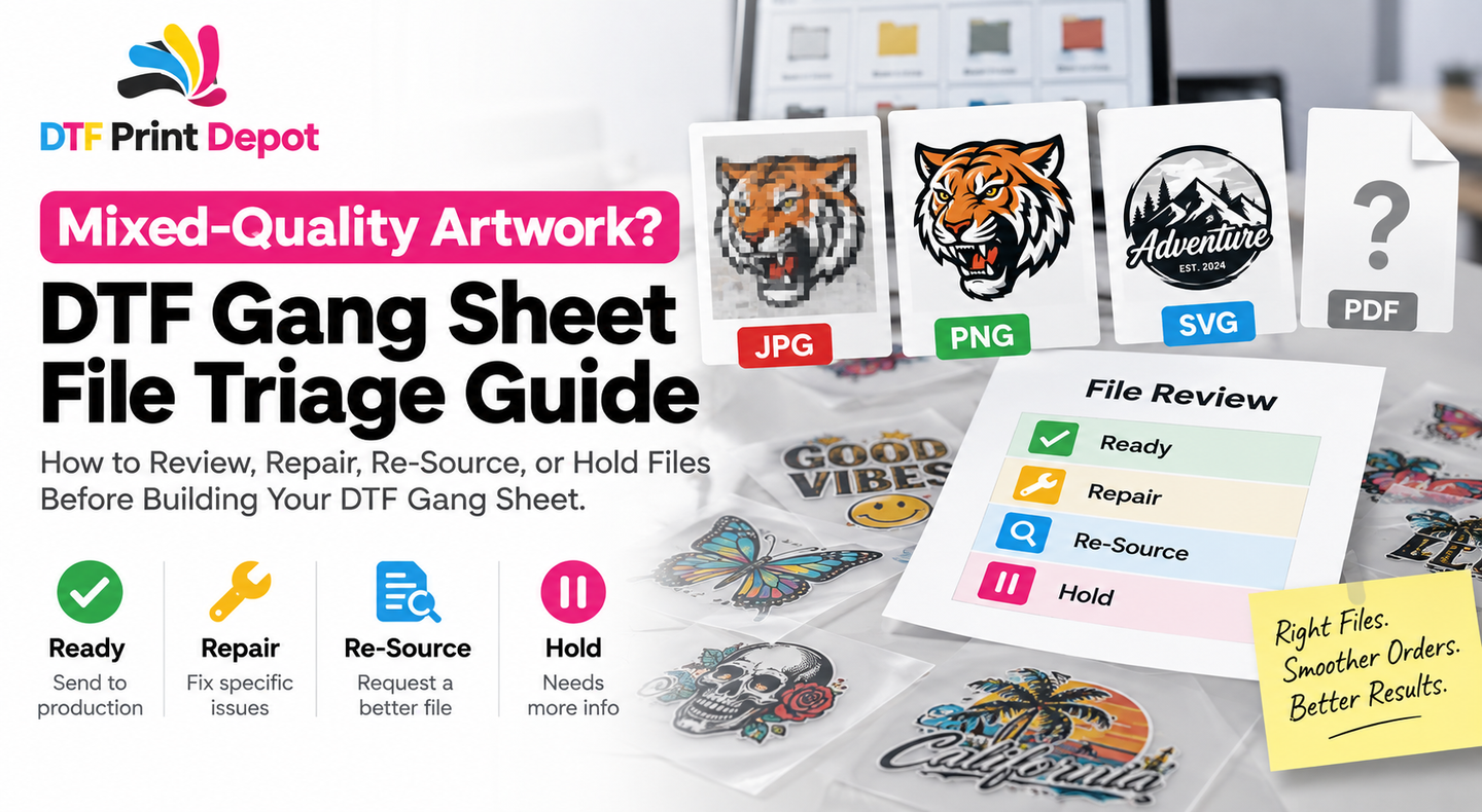
A blurry logo and an overly intricate logo are not the same problem.
A low-quality source image may lack enough usable visual information for the intended size. That calls for a better source file, a rebuilt graphic, or another file-quality solution. A clean high-quality file can still contain text or details that are simply too complicated for the physical size you want to use.
For broader technical file-preparation checks, review the DTF artwork file preparation guide.
Do not confuse source quality with readability. A technically clean file does not guarantee that every design decision remains effective at every size.
Choose the Finished Transfer Size Before You Approve Fine Detail
Fine-detail review cannot be separated from physical dimensions.
The same artwork may work well as a large back print but require simplification as a smaller front placement. If the design will be produced in more than one size, evaluate each important size independently rather than assuming the largest version proves that all smaller versions will work equally well.
If you are still deciding how large the transfer should be on the garment, use the DTF transfer sizing guide before locking the fine-detail artwork.
Size should come from the garment and design purpose, not from whatever dimensions happen to fill an open space in the gang sheet.
Use a Four-Decision Fine-Detail Review
For each questionable element, choose one of four actions:
- Keep: The detail is clear and meaningful at the intended size.
- Strengthen: The element matters, but its visual weight or spacing should be improved.
- Enlarge: The design or individual element needs more physical space to remain readable.
- Remove or simplify: The detail adds complexity without enough value at the final size.
This creates a better decision process than repeatedly zooming in and asking whether the detail still exists in the digital file.
Check Each Size Variation as Its Own Artwork Decision
If a design is needed in both a small and large version, avoid treating the smaller file as nothing more than a scaled-down copy.
The large version may support secondary wording, textures, or illustration detail that the small version does not need. Creating a simplified small-format version can sometimes preserve the overall identity better than mechanically shrinking every component.
This is especially useful for branding systems that use the same visual identity across a small chest mark and a larger back graphic.
Review Fine Detail Before Building the Gang Sheet
Once a design is placed repeatedly across a layout, correcting it becomes more disruptive.
Finish the readability review first. Confirm the intended physical size, resolve questionable text and small elements, and make sure the production version is clearly identified.
Then add the approved design to the DTF gang sheet workflow.
The gang sheet should contain artwork that has already passed the design decision. It should not be the place where you discover that a critical line of text is too crowded.
Run a Final Normal-Size Review
Before submission, review the actual production artwork again without extreme zoom.
- Can essential wording be read clearly?
- Are important letters visually distinct?
- Do thin elements still contribute to the design?
- Are tiny detached details actually necessary?
- Is negative space still clear?
- Has the artwork been evaluated at the intended dimensions?
- If several sizes exist, was each important size checked independently?
- Is the version on the gang sheet the approved fine-detail version?
Frequently Asked Questions
Is there one minimum font size that works for every DTF design?
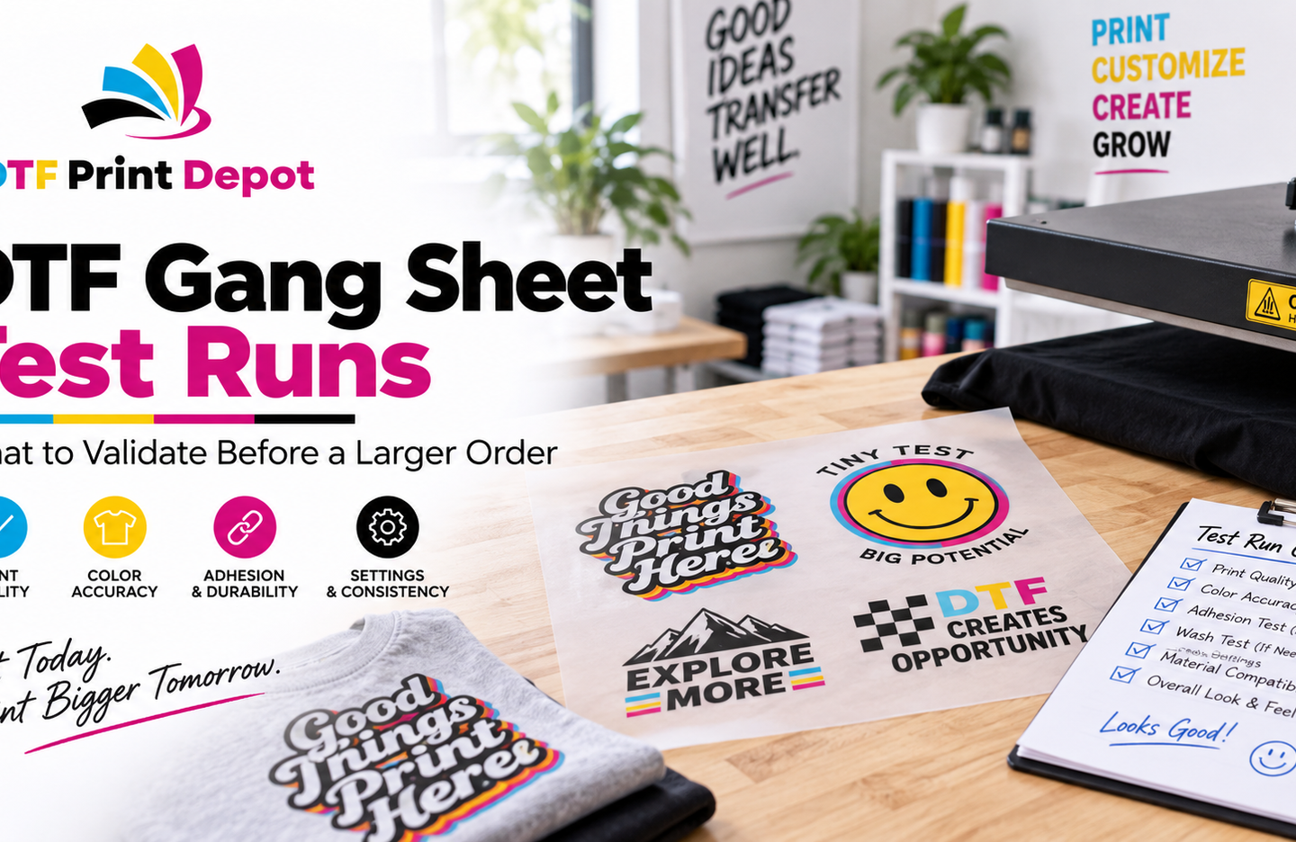
A single number does not account for differences in typeface, letter shape, line weight, contrast, artwork construction, final transfer size, and production conditions. Review important text at its intended physical size and validate delicate designs before committing to a larger run.
Will higher-resolution artwork fix text that is too small?
Not necessarily. Better source quality can improve a file-quality problem, but it does not change the physical size of the letters. If the wording is too visually crowded at the intended transfer size, the design itself may need to change.
Should a small version contain exactly the same details as a large version?
Not always. If secondary details become distracting or unreadable when scaled down, a simplified version can preserve the main identity more effectively than forcing every element into the smaller format.
Design for the Size People Will Actually See
Fine-detail preparation becomes much easier when you stop asking whether every digital element can be preserved and start asking what the finished transfer needs to communicate.
Set the intended size first. Protect the information that matters. Simplify low-priority detail when necessary. Review text and linework at real scale before the layout is built.
A gang sheet can reproduce only the artwork decisions you give it. Make the readability decision before the design becomes one of many repeated graphics on the sheet.